
Role
Product Designer
Timeline
2024 to Present
Org
Omission
With
Afaan Muhammad | AI Engineer
Mike Wu | Full-stack Developer
Mohammed Shomis | Full-stack Developer
Selin Çakmak | Full-stack Developer
The Mission
Building an AI reporting tool for people who don't trust AI and don't love computers.
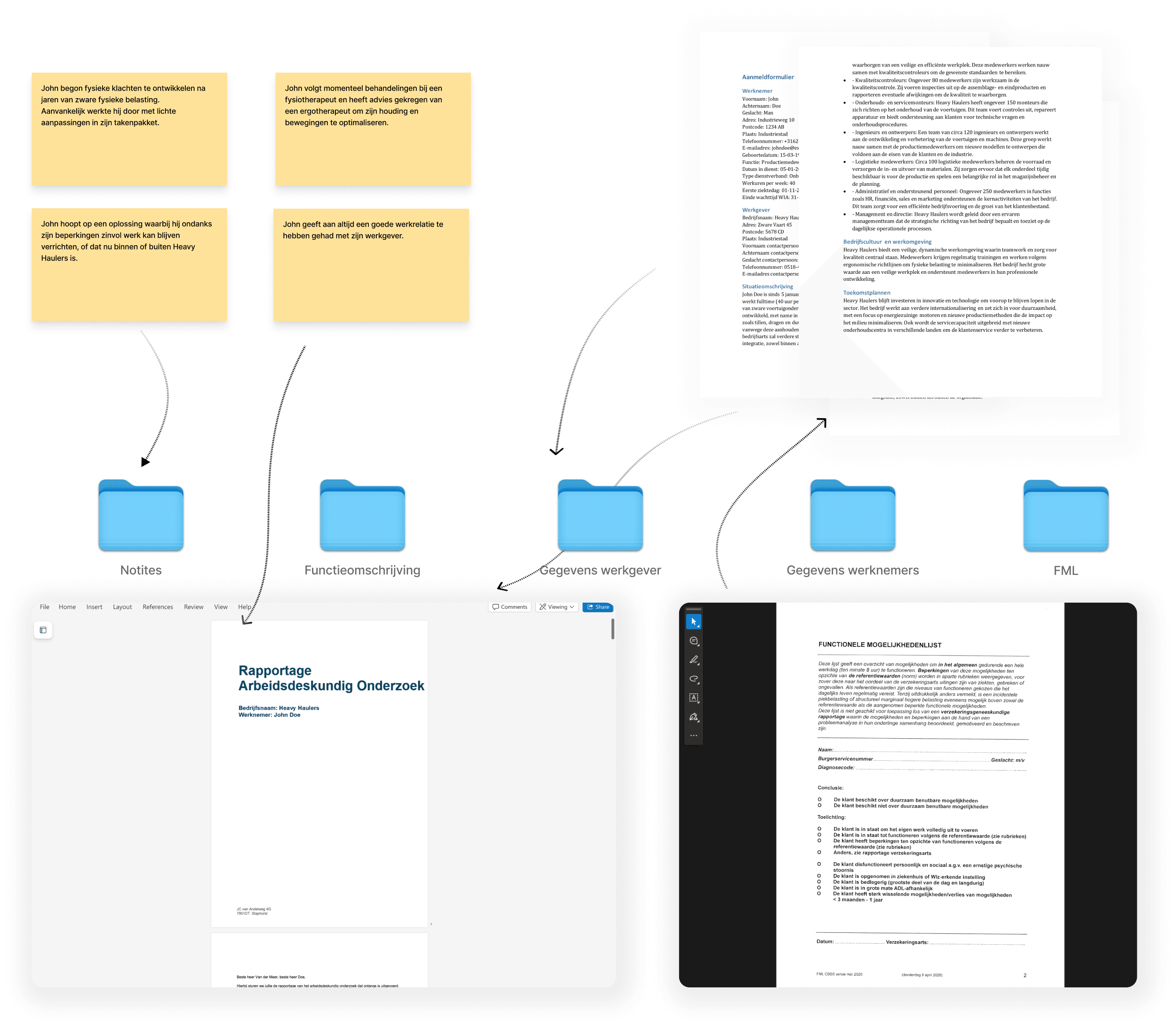
Arbeidsdeskundigen (Dutch occupational health experts) spend hours retyping information from medical files, employer statements, and job analyses into long-form assessment reports. The work that matters is the judgment. The work that eats the day is the transcription. We had three months to ship an MVP that would change that. I owned the product design end to end: research with practicing arbeidsdeskundigen, concept exploration, interaction and interface design, usability testing, and part of the front-end implementation alongside Mike.
The real constraint wasn't the deadline
Our users are experienced professionals, often later in their careers, and generally not confident with software. Several told us their previous reporting tools cost them time rather than saving it, they'd tried, and given up.
That reframed the problem. We weren't competing with manual work. We were competing with distrust of software itself. A tool that was powerful but confusing would fail the same way the last one did. Two things followed from that: Every AI output had to be inspectable and editable. Not a black box that produces a report, but a draft the expert corrects. The professional judgment stays theirs; the product just removes the typing. Complexity had to be spent carefully. Three months meant we could build one thing well. Not a flexible workspace with many entry points.
Receives invite email for the testcase
Opens the link on desktop
Creates an account / signs in
Looks around the empty product
Tries to understand where work starts
Hesitates before uploading anything
Uploads medical / employer files
Waits for AI analysis
Reviews generated draft sections
Edits and corrects the draft
Starts the next dossier alone
Reuses the same upload → review path
Generates a complete report
Invite email
Sign-in / landing screen
Home / empty state
Navigation
Help / tooltips
Sample language in UI
Upload entry point
Progress hints
Support contact
Upload drop zone
Analysis / processing state
Section review UI
Inline edit controls
Source document viewer
Save / continue
Dossier list
Familiar step flow
Report export
Return session
Invite opened
Account created
First session started
Time from invite → login
Reached upload CTA
Started a dossier
Abandoned before upload
Time on first screen
Files uploaded
Analysis completed
Sections heavily edited
First dossier finished
Second dossier started
Reached step four first session
Time to complete report
Return within 7 days
Unclear what ADO Pro is for
Low trust in yet another reporting tool
Fear of wasting time on setup
Too many possible entry points
Software anxiety: previous tools failed them
Unclear what documents are needed
No sense of how long it will take
Worry that AI will invent content
Black-box output feels unsafe
Hard to see what came from which file
Edits feel slow or fragile
Unsure when the draft is 'good enough'
Abandons mid-dossier without feedback
Still unsure about authorship / liability
Doesn't know if the tool is worth switching
Promise: assistant, not replacement
One clear next step after login
Single drop zone: no decisions yet
Show the path: upload → review → report
Use their language, not product jargon
Visible progress while files process
Reassure: every output stays editable
Inspectable, editable AI drafts
Link claims back to source docs
Keep judgment with the expert
One linear dossier flow, not a toolbox
Instrument abandon points in Mixpanel
Track which AI sections get edited most
Measure first-session completion to step 4
What we shipped
Upload documents
The entry point had to feel effortless for users who abandon software the moment it gets complicated. One drop zone, any file type, no decisions to make yet; the goal was to get them to a first successful action before the product asked anything of them.
AI analysis & processing
This is where the product is doing its heaviest work, so the design job was managing trust during waiting. Rather than a spinner on a blank screen, the interface shows extraction and categorisation happening in place; turning invisible AI processing into something legible, so it reads as working rather than stuck.
Review & adjust
The core promise lives here: the expert stays in control. AI-generated content is laid out section by section as an editable draft, with a chat sparring partner inside the dossier. The design keeps the professional's judgment central; the product proposes, the expert decides, which was the exact anxiety our research surfaced.
Generate report
The final step had to disappear into the user's existing workflow, not impose ours. One click produces a complete report in the firm's own template, formatted the way their clients already expect; so the output creates zero rework and the value is immediately usable.
Results
70%
Time saved on administrative tasks
99%
Accuracy in document analysis
3X
Faster complete reports
what we learned, and what I'm testing next
We stayed in direct contact with the first users rather than inferring behaviour. Their language shaped the positioning: the recurring concern wasn't accuracy, it was authorship. The answer we'd designed toward: assistant, not replacement, became the product's central promise.
We learned that conversation is high-fidelity but low-coverage. We only heard from users willing to talk to us. So I proposed instrumenting the product with Mixpanel and instead of starting from events that were easy to log, I went back to the user journey and mapped the moments that would actually tell us something: where people abandon a dossier, which AI-generated sections get edited most heavily, and whether anyone reaches step four on their first session.